Project Brief
Family Renewal Project (FRP) approached me with a need to refresh their brand and establish two new sub-brands: Catholic Disciple Institute (CDI) and Good Shepherd Institute of the Bluegrass (GSIB). The identity as it stood was dated, unfocused, and not in usable formats. I recommended updating the FRP logo right away. I then expanded the brand typography, making a few swaps from trendy fonts to more timeless options, and made some slight changes to the color palette and brand elements — resulting in a polished brand book and refreshed identity. Catholic Disciple Institute required a complete overhaul of every element, starting with a brand identity brainstorming meeting to help the client dig deep and pinpoint their audience, some keywords to describe the brand, and the look and feel they wanted to accomplish. For Good Shepherd of the Bluegrass, I created a softer, custom-illustrated logo that fit right in to the broader strokes of the FRP brand.
Brand Identity, Brand Revision, Illustrative Logo, Print Design, Publication Design, User Experience, Social Media Identity, Website
Project Type
Brand Book, Logo Package, Business Cards, Letterhead, Website Design, Social Media Graphics, Flyers, Marketing Materials, Gala Package
Deliverables
Old logo
Updated Logo Package
How I solved the problem
I identified several issues to correct from the get-go: there was only one logo format, making it difficult to use when a horizontal logo was needed or for small printing; it was unbalanced, feeling very left-side heavy and awkward; the monogram letters were cut in half, making them difficult to read for anyone not familiar with the brand; and the type running through the center of the monogram was too small to read in many cases.
I wanted to honor the previous brand and preserve the olive branch, which the client specifically requested I keep. I started by creating a version of the logo using the full brand name, since the monogram alone doesn’t mean anything to someone unfamiliar with the brand. I chose a san-serif typeface in keeping with the current brand, and added roundness to the letterforms to soften and create a welcoming feel. By using different font weights, I emphasized Family Renewal — the main takeaway we wanted to convey.
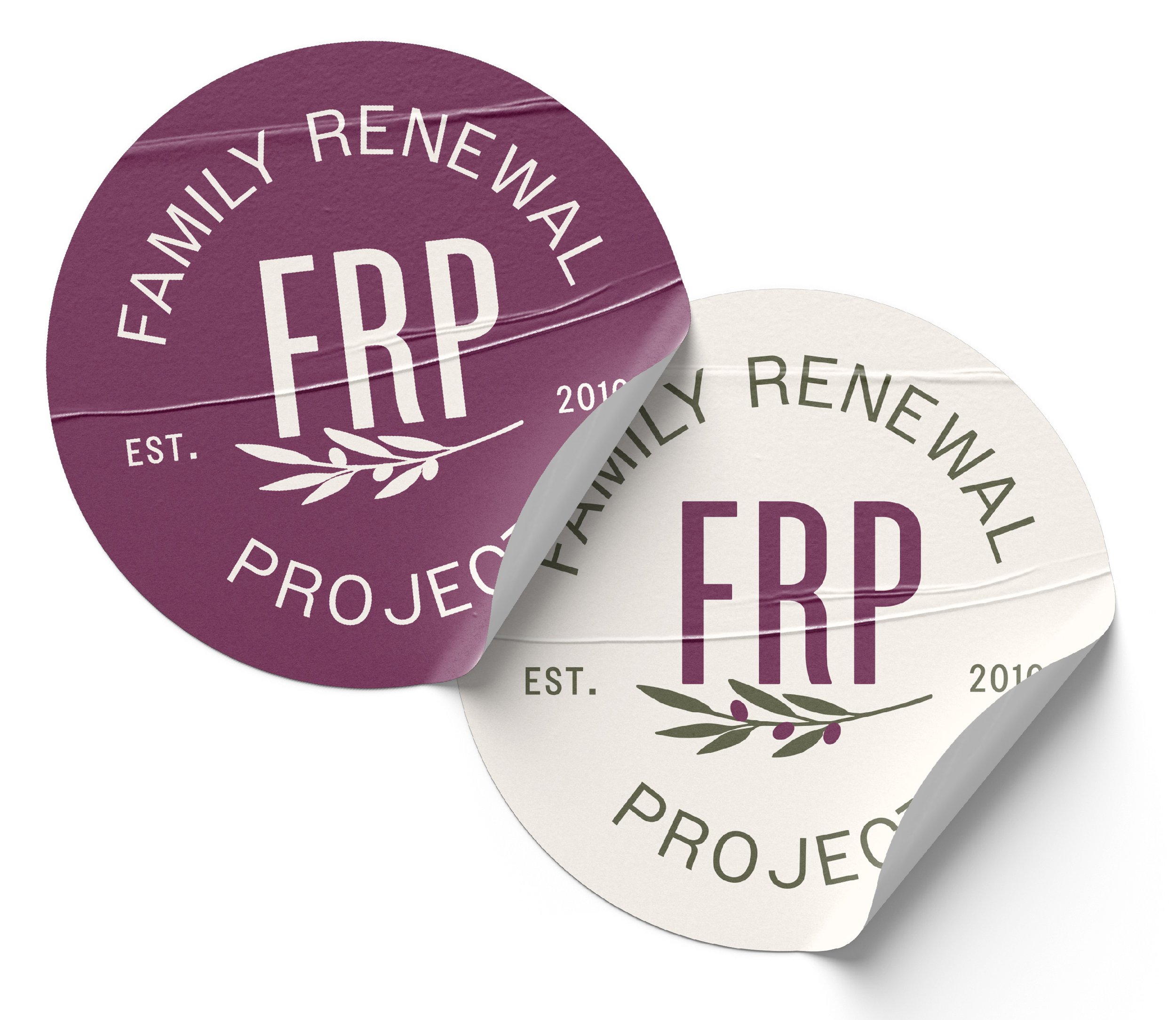
The client requested I keep a version of the logo with the FRP monogram. To do this effectively, I first visually balanced the olive branch and monogram so the logo wouldn’t appear lopsided. Then I created a round version of the logo with Family Renewal Project surrounding the monogram, instead of cutting through it. This kept the FRP monogram as an option, while ensuring the brand name was still prominent.
The end result: a new logo package with a more polished look, functional in multiple use cases, and in keeping with the feel of the previous brand.
Polished Typography
Balanced Elements Visually
Improved Readability
Created Logo Variations for Usability
Old logo
Updated Logo Package
Clarified Brand Vision and Identity
Simplified Logo Elements
Improved Usability
How I solved the problem
Now that we had a fresh brand to work with for FRP as a whole, the next step was to look at their flagship program, which they loosely called Discover Your Story. The program’s brand as it stood was unfocused and convoluted; the name, Discover Your Story, wasn’t conveying the “what” and the logo only made things more confusing. The seashell spiral shape, the rainbow colors presented as LGBT, it was leaning in a new-age direction — none of this was their intention. To correct course for this brand, I first narrowed down the What: a brand that captures both educational learning and more adventurous retreats and experiences, all directed toward building Catholic disciples. It needed to clearly communicate a Catholic educational institution with some teaching authority for adults and children. They wanted the logo to be meaningful, and it also needed to be translatable into submarks.
I first recommended changing the name to Catholic Disciple Institute, while keeping Discover Your Story as a tagline. This immediately made the focus much clearer. I then recommended choosing a new symbol; the spiral stained glass window was not functional as a logo, and was obscuring the brand. To capture a discipleship direction, I chose a flame shape, in which I was able to incorporate a winding road to symbolize the journey of discovery (and as a nod to the Road to Emmaus).


Old logo
Updated Logo Package
Pinpointed Sub-Brand Vision
Illustrated Custom Icon
Incorporated Overarching Brand
How I solved the problem
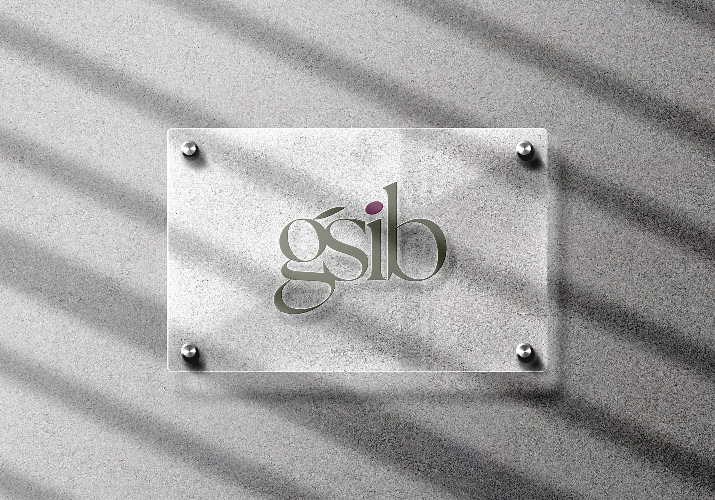
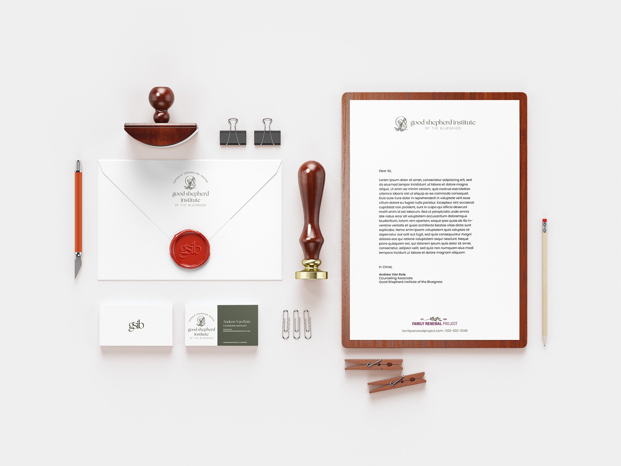
For Good Shepherd of the Bluegrass, I created a softer, custom-illustrated logo that fit right in to the broader strokes of the FRP brand. We wanted it to be recognizably related to FRP as a whole, while retaining it’s own identity. I chose to keep the type lowercased to feel more friendly, approachable, and therapeutic. For this brand, I also created a logomark for certain use-cases — the i being dotted with an olive from the main logo sealed the deal for the client.

Family Renewal Project
The New Brand Identity

